Why Most Products Don't Look Right After Frontend Development (And How to Fix It)
Building a digital product is exciting. You invest time, money, and energy into getting it right from the first strategy call to the final design approval.
You finally approved the design. It looked great, clean, and professional, exactly what you wanted.
Then your development team said, "It's done."
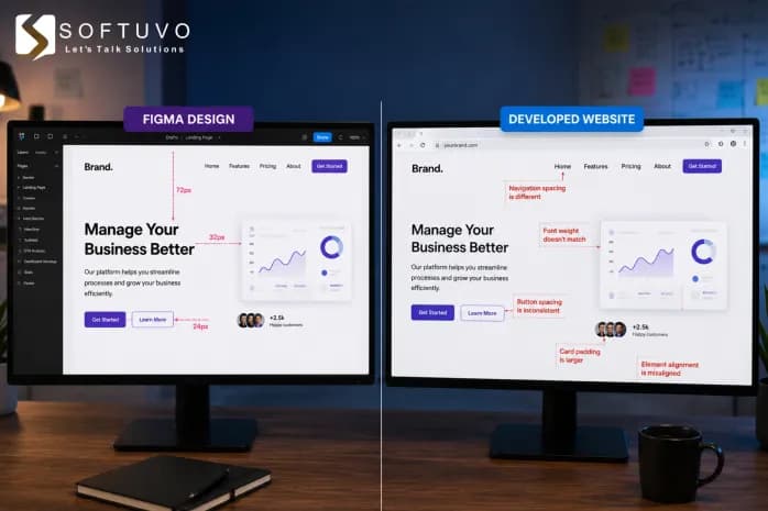
You opened the product, and something felt off. The fonts looked slightly different. The spacing was uneven. On mobile, the layout was inconsistent. It didn't feel like the design you signed off on weeks ago.
If this sounds familiar, you are not alone. This is one of the most common frustrations that business owners, founders, and product managers face after investing in a product build. And the good news is, it's rarely anyone's fault. It's a process problem, not a people problem.
In this blog, we'll break down exactly why this happens during front-end development and, more importantly, what you can do to make sure it never happens to your product again.
What Actually Happens Between Design and Front-End Development
Here's something most clients are never told upfront:
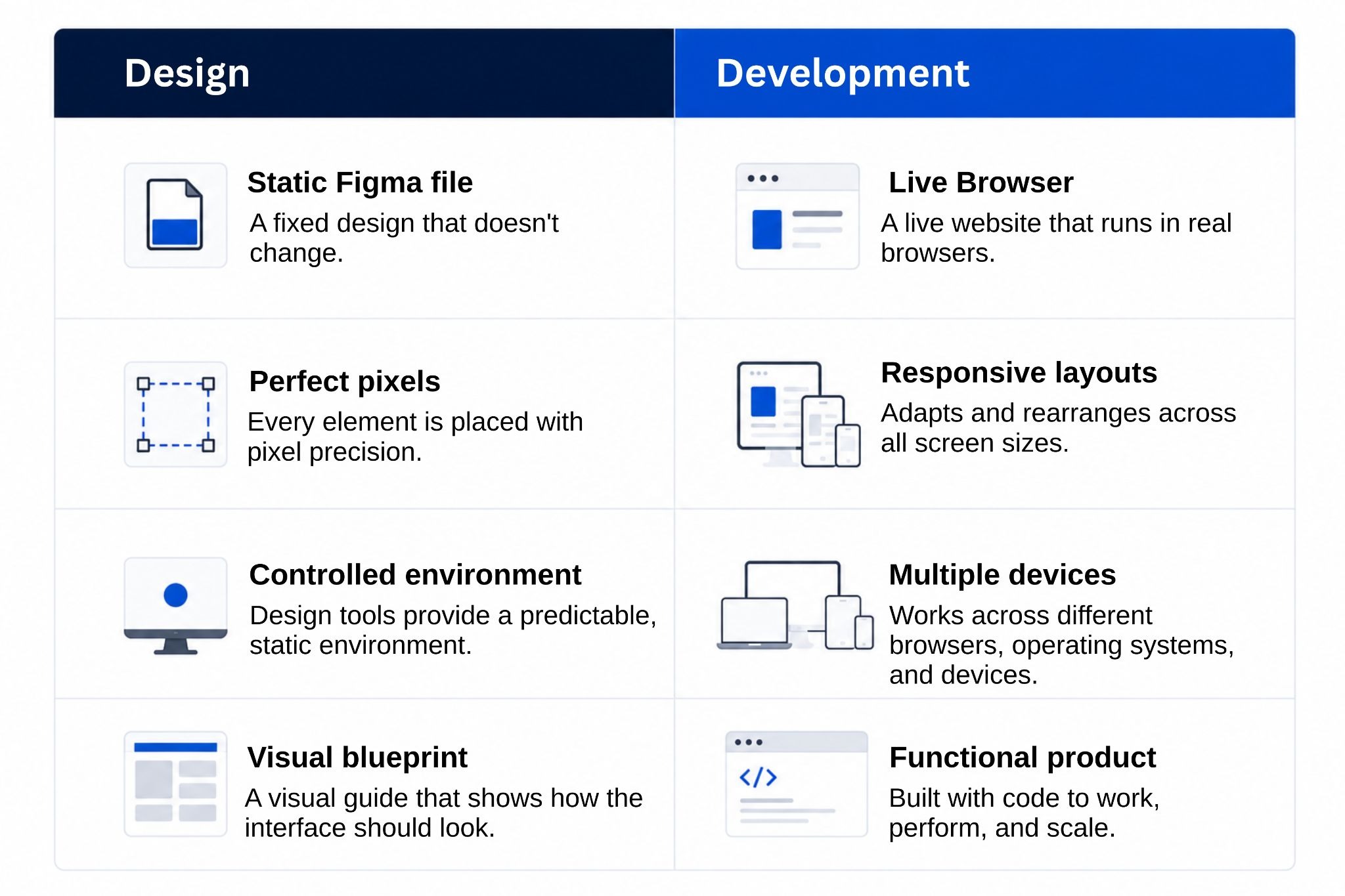
Designers and developers work in two completely different worlds.
Designer | Developer | |
Works in | Figma: a static, pixel-perfect tool | Real browsers on real devices |
Environment | Controlled. Nothing moves or resizes | Dynamic. Every screen size is different |
Output | A visual blueprint of how it should look | Live code that has to work everywhere |
Think of it like an architect's blueprint vs the actual building. The blueprint shows how it should look. But construction with real materials, real conditions, and real constraints always introduces small differences.
Those small differences are what you notice when your product doesn't look right.
The Figma mockups your team approved are a vision. Turning that vision into a tangible product requires a deliberate and well-managed process. Without it, things drift, and that drift shows up in the final product.
The Top Reasons Most Products Don't Look Right After Front-End Development
Let's go through the most common causes:
1. Nobody Agreed on a Design System Before Development Started
A design system is basically a rulebook. It defines things like:
Which fonts to use and at what sizes
What the exact brand colors are
How much space goes between elements
What buttons, icons, and cards should look like
When there's no design system agreed upon before front-end development begins, developers have to make these decisions on their own, screen by screen, page by page. And they make slightly different choices each time.
What you end up seeing: Button styles that look slightly different on different pages. Inconsistent font sizes. Spacing that feels "off" in some sections and fine in others.
Real-world example: Airbnb built their Design Language System (DLS) to solve exactly this problem. After implementing it, they saw a 35% reduction in design-to-development handoff time and significantly fewer design inconsistencies across their product. (Source: UXPin, Grokipedia)
2. Figma Mockups Were Shared as Images, Not Proper Specs
This is one of the most common mistakes in the entire design-to-development process.
When a designer finishes a screen in Figma, they sometimes export it as an image and hand it to the developer. The developer then has to look at that image and guess:

How many pixels is this margin?
What font size is this heading?
What color exactly is this button?
What should this look like when someone hovers over it?
Visily's research on design handoffs directly confirms this: developers are forced to interpret rather than implement when specs aren't provided, leading to layouts that look close but feel consistently "off."
What you end up seeing: A product that resembles your design but feels slightly wrong everywhere.
Proper Figma mockups should include annotations, measurements, font details, color codes, and interaction states, not just a screenshot to copy.
3. Responsive Web Development Was Never Planned in the Design Phase
Here's a stat worth knowing: mobile devices now account for 64.35% of all global website traffic as of mid-2025. (Source: StatCounter / Quantumrun)
That's more than 6 out of 10 visitors coming from a phone.
Yet in many projects, the design is only created for desktop, and nobody defines how it should behave on smaller screens. The developer is left to figure it out alone.
What you end up seeing:
The layout looks great on desktop, but is broken on mobile
Buttons are too small to tap
Text that overflows or gets cut off
Images that don't resize properly
Responsive web development should never be an afterthought. It needs to be planned from the very start, for every screen size.
4. UI Development Happened in Isolation With No Check-Ins Along the Way
Many projects follow the same pattern:
Design is finalized
Design is handed off to developers
Nobody looks at it again until development is "done"
It looks completely different from what was approved
When UI development happens in isolation, without regular check-ins between design and development, small misinterpretations compound over time. A tiny spacing mistake on screen one becomes a bigger inconsistency across twenty screens.
Once communication drops below a certain threshold, assumptions multiply. And assumptions compound faster than bugs. By the time inconsistencies are visible, they're embedded across multiple pages and components.
What you end up seeing: A final product that looks like it went in a completely different direction from the original design, even though everyone was technically "doing their job."
5. The Development Team Had Great Coding Skills But Weak Design Sensitivity
This one is uncomfortable to say, but it's real.
Not every developer has a strong eye for design. They can write clean, functional code, but still deliver something that looks slightly off because pixel-level details weren't prioritized.
The kinds of things that slip through:
Line height that's too tight, making text feel cramped
Images that aren't quite aligned
Shadows or borders slightly off from the design
Hover states that feel jarring instead of smooth
Everything technically works. But it doesn't look right.
This is why the best front-end development teams aren't just great coders; they genuinely care about how the final product looks and feels, not just how it functions.
What This Costs Your Business
This isn't just a visual problem. It has real business consequences.
Delayed launches: Rework cycles push your go-live date back by weeks or even months
Budget overruns: Fixing issues after development is far more expensive than catching them early.
Lost user trust: First impressions matter. A product that looks unpolished signals an untrustworthy brand, no matter how good your service actually is.
Missed market opportunities: While you're spending weeks fixing visual issues, competitors are launching and capturing your potential customers.
How to Fix It, Before It Costs You More
The good news: every single cause above is completely preventable. Here's what needs to change.
1. Lock a design system before development starts
Agree on fonts, brand colors (with hex codes), spacing rules, and component styles (buttons, inputs, cards, and icons) up front. This becomes the single source of truth, so developers aren't making style calls screen by screen.
2. Hand off specs, not screenshots
Figma files should include exact measurements, font details, color codes, asset exports, and all interactive states (hover, click, disabled, and error); a full instruction manual, not a picture to copy from.
3. Design for mobile, tablet, and desktop from day one
Responsive behavior, what resizes, what hides, and what shifts should be a design decision, not something a developer improvises after the fact. With mobile now driving 64.35% of global website traffic, this can't be an afterthought.
4. Review at 30%, 60%, and 90% of development
A spacing error caught at 30% takes minutes to fix; the same error caught at 100% can mean days of rework. Regular check-ins keep small drifts from compounding into a final product that looks nothing like what was approved.
5. Choose a team where design and development sit together, not in silos
This is the fix that makes the other four actually stick. When designers and developers work side by side, flagging issues during the build, not after, what you approve is what your users see. At Softuvo, that's exactly how our teams work: no gap, no drift, no surprises at launch.
What to Look for in a Front-End Development Partner
Before signing with any agency or development team, ask them these questions:
Do you have an in-house design team that works alongside your developers?
What does your design-to-development handoff process look like?
How do you handle responsive web development? Is it designed upfront or done after?
At what stages can I review the product during development?
Can you show me examples where the final product closely matched the original design?
The right team won't hesitate to answer any of these. If they can't explain their process clearly, that's your answer.
Final Thoughts
The gap between what your product looks like in a design file and what it actually looks like after front-end development is real, but it is entirely preventable.
It doesn't require a bigger budget. It doesn't require starting over. It requires a better process, one that connects design and development from day one, not just at the handoff.
The right partner won't just build what you ask for. They'll make sure what you asked for in the first place is exactly what gets delivered.
Ready to build a product that actually looks the way you designed it?
At Softuvo, our design and front-end development teams work together from strategy to launch, so your product looks as good in the browser as it does in the mockup.
Front-end development
Front-end engineering that matches the design, pixel for pixel
Softuvo builds Angular and React front ends with the performance, accessibility and test coverage your product needs.
Prefer email? Write to [email protected] or use the contact form.