5 Compelling Landing Page Practices for Higher Conversions - Softuvo

Everyone talks about landing pages, but the question is are they really worth the attention? The answer is a Big Yes! Well, landing pages are the potential gold mines for every business. It is the spot where you lure your customers and help make conversions. Usually, marketers look for ways to make more conversions through the landing pages and ways to optimize them better.
Now you must be wondering, how to create an effective landing page? Well, there is no word as perfect when it comes to landing pages. These evolve with the trends and customer behavior! However, there are a few things that can help you in creating an impressive landing page that will surely mark a spot in your audience’s heart and make sound conversions. Let’s begin the read to know more.
Catchy Headlines Will Pave Their Way Out

Headlines are like the picture titles - they should be interesting and draw the users' attention. In short, they should give users a good reason to take the desired action. So, you should create headlines that showcase the value to your customers. For this, you have to make use of the relevant keywords in the headings and then optimize the pages for the search engines. Trust me, this can instantly double your conversions. Also, you need to assure that the headlines you create should complement the content accompanied on your site. Otherwise, it's a big red flag as it may land the customers on the wrong page. And, it will ultimately affect the conversion rates.
Say No-No To Distractions!
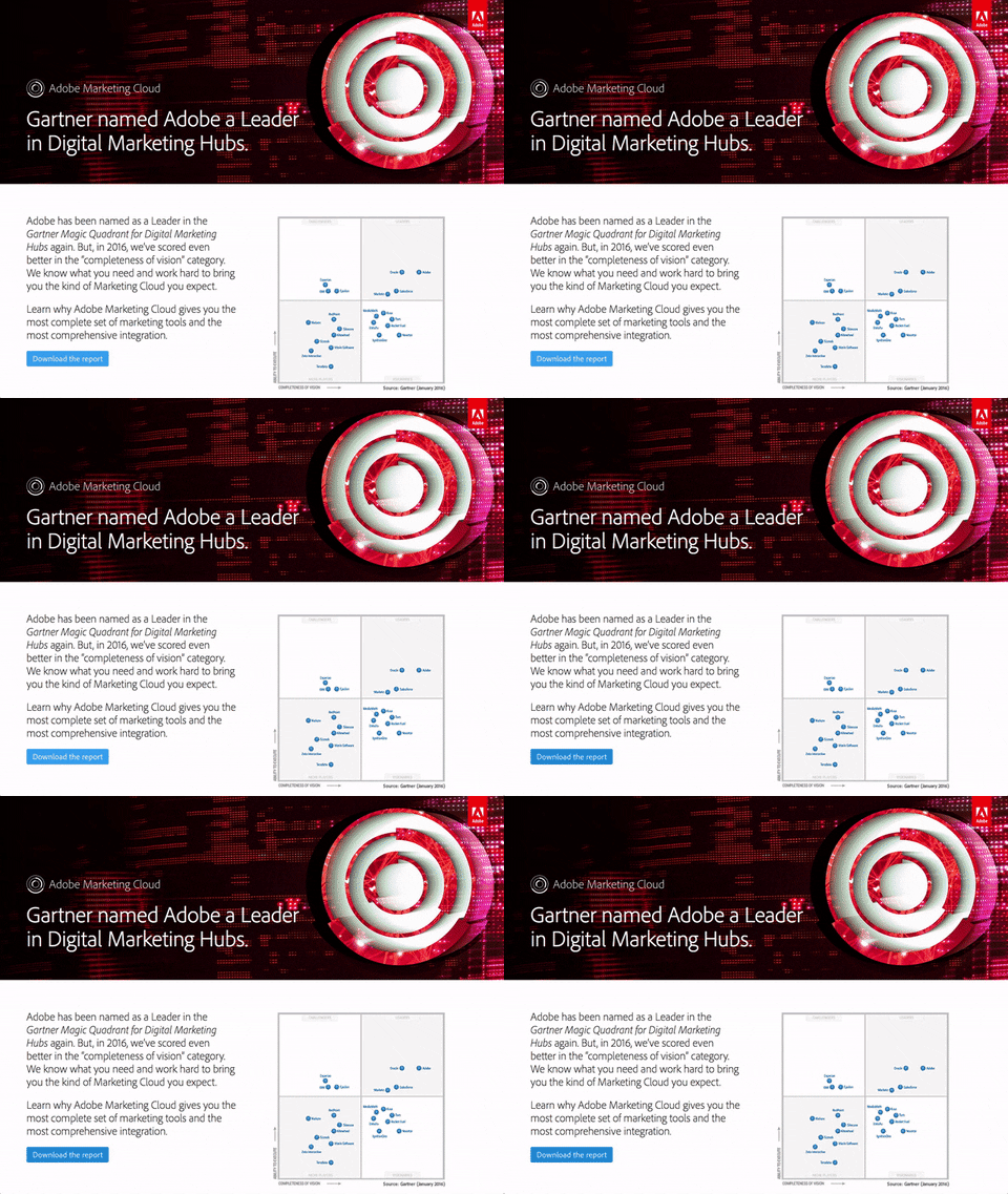
Now before you analyze the distractions, jot down the things you want your users to focus on. Once you know that, understand that everything else is a distraction for the users. So, make sure you use navigation bars, extra links, no footers on your landing pages. It will all create a mess! Do you know the attention span of an average person is around 8 seconds? Imagine! This means the most effective landing pages are the ones that minimize the amount of text on the page. Visitors don’t have time to read lengthy texts on the side. So, try to keep the landing page a little concise while conveying the value proportion clearly.
A Clear Call-To-Action Is A Must

It's a must must must thing to do!! Without having a clear call-to-action on the site, your visitors will get lost. They won’t be able to analyze what to do and where to go next. And, they may end up leaving your site! So, make sure you place the CTAs (call-to-action) in an optimum position on your landing page. For this, you can use directional cues like - photos, arrows, or pointers that indicate the call-to-action clearly. The whole idea is to bring the attention of the users to the CTA and urge them to take the next step. The next thing you need to look into is the font and background color to highlight the CTAs. You can use contrasting colors to give a more appealing look to your CTAs. The whole idea of CTAs' look and placement is to make users click the button and take the next step to reach your products/services.
Interactive Forms Are A Win-Win

What is the most annoying thing when you visit a site? Filling up random long forms and getting unnecessarily pop-ups. Long forms where the users have to add tons of information is a big no. such forms can surely drift the visitors away from the web page. But, yes, if your goal is to drive the signups through conversions, then you surely need to keep the landing page. However, you need to keep in mind a few things to avoid frustrating your customers. For example - you need to make your landing page more intuitive and interactive. The format of the forms should be easy, so the users can make easy fill-ups and enter the right information with ease. Apart from that, you must include some labels in every field. It should be clear what type of information you are seeking in the particular field. Regular prompts can also be a great way to continue guiding the people while filling up the forms. You can also minimize the need for typing more but highlight which fields are mandatory to fill and which not. It will help the users fill forms quickly and will enhance their user experience by ultimately boosting the conversion rates.
Don’t Miss On The Testimonials Section

Your landing page is the showstopper face of your website. It is the best opportunity to impress your clients and show them what you’ve got! Building trust in the customers should be the main priority when creating the landing pages. When a customer trusts a website their purchasing decisions are influenced automatically. So, what’s the trick to earn that trust? Well, add testimonials to the website. Yup, that’s true! Adding testimonials and reviews can literally win over the customers and influence their buying decisions. It has been recorded that more than 55% of online shoppers have a habit of reading reviews before making any purchases online. Testimonials are considered as strong trust signals that basically indicate other people for the valuable services and products available. It gives them the confidence to make the right decisions and gives them a sense of contentment.
Wrapping Up!
Well, these were a few recommendations that can surely be a game-changer for your business. By trying these convincing landing page practices, you can surely boost the conversions and win over your audience. Don’t forget that your landing page plays a vital role in your marketing success. Having a well-optimized landing page will not only boost your overall sales but also help in generating leads. All in all, an impressive and robust landing page is a powerhouse of conversions.
What are your thoughts on this? Is there something that we are missing? Feel free to share your thoughts with us. We love reading feedback! :)
